Fargô
Branding | UI | UX
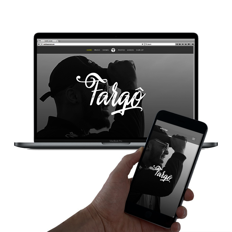
This brand involved an original logo & website for a new emerging artist who has had a great start to his career so far, with a heavy social media following. His music can be heard on all of the music platforms, such as Apple Music, TIDAL, Spotify, YouTube & SoundCloud. Fargô continues to perform all over at well-known venues where he leaves his mark as an artist to look out for.
Logo Design
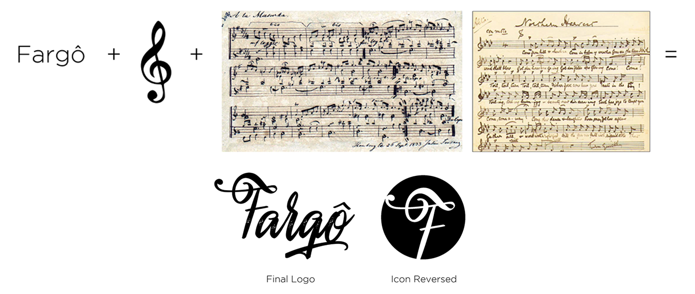
Designed as a wordmark logo with a creative approach taken by introducing a pictoral element to it. Overall there is a balanced feel in the name due to the script letters that would normally come off elegant, that go well with some of the rigid ends throughout that give it more of a handwritten, street feel. There is some light distressing on the middle of each letter to play more on the handwritten style. The pictoral element is a treble clef note, which every piece of sheet music would start with. It was incorporated in a way that isn’t so obvious, but once noticed it is similar to the FedEx logo with the hidden arrow. The F incorporated with the treble clef, as an icon could be used on its own for social media platforms or just a second version of the original logo for the brand.
Color Palette
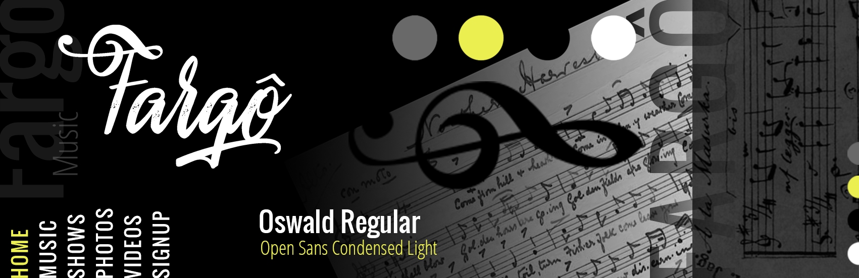
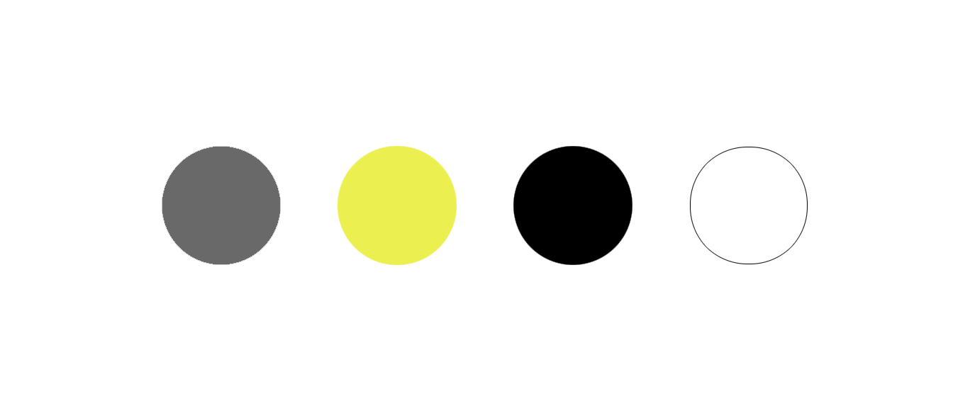
The high contrast of the overall clean black & white incorporated throughout the branding was intended to give the website a clean, modern feel. Throughout some of the website there are slight accents of yellow to make certain elements pop for the viewer’s eye. The combination of the bright yellow & white alongside the darker shades create a colorful visual balance that make it easy to navigate the eye throughout the website.
Typography
There are two main typefaces that are used in the branding. One is considered the title font & the other is the content font. The use of both sans-serif typefaces, even though similar fonts are used in a way to create visual contrast throughout all of the typography due to the variation in weights.