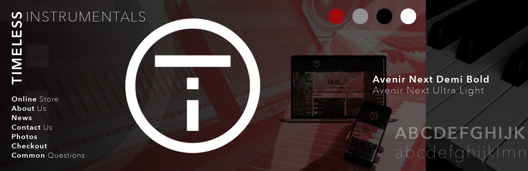
Timeless Instrumentals
Branding | UI | UX | eCommerce
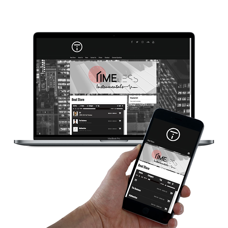
The production company artists can count on for any sound they may need to give them that perfect platform for their next hit. The artist can either download an original premade sound through the website or contact the producers directly to request the specific sound they need.
Logo Design
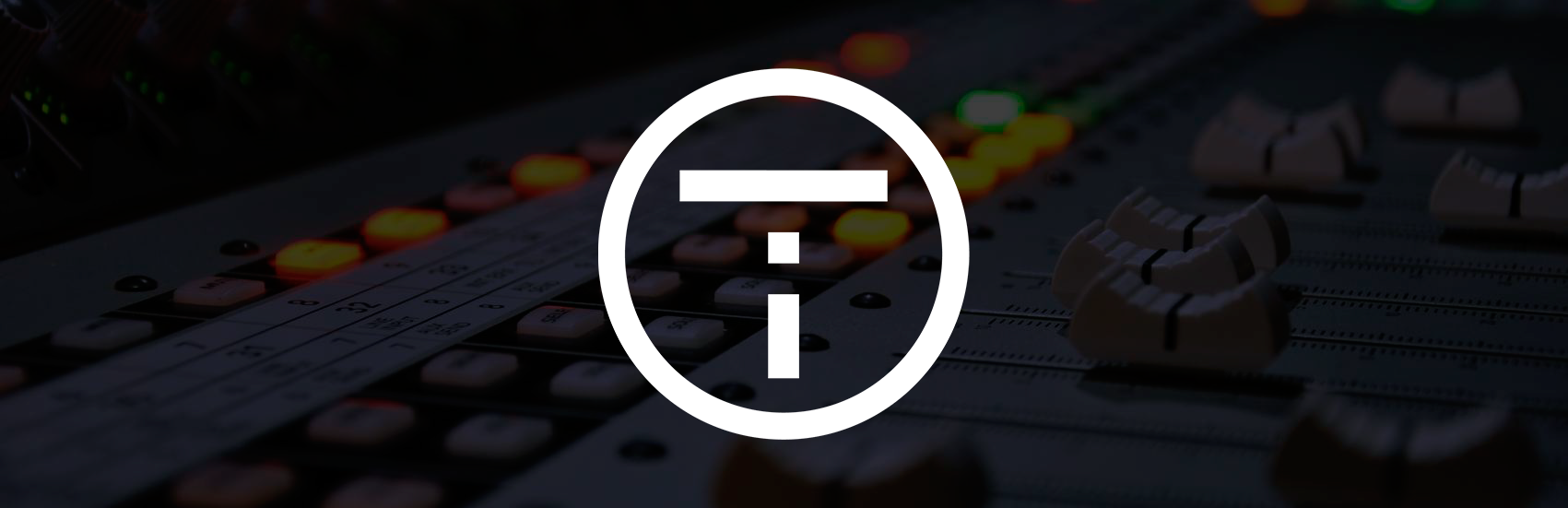
Designed as a lettermark logo. The logo is made up of the two letters of the company, which are T and I for the company’s initials. They’ve been placed in such a way that they can be easily read individually, as well as together with the proper hierarchy of the T being read first. The bold geometric sans-serif typeface helps to give the logo a very balanced, symmetrical feel. The client wanted something bold that would be easily legible in solid black or reversed in white as displayed. The client needed a logo that could be used across all forms of media, but most importantly as an icon for videos at the lower right or as part of an intro for their channels.
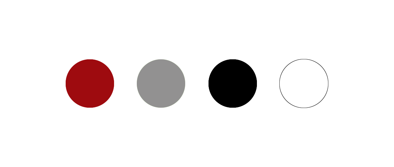
Color Palette
The high contrast of the clean black and white incorporated throughout the branding was to give the company a bold feel. The client wanted strong elements to go with the sound they were producing. Throughout some of the website there are slight accents of red to give that sense of passion and emotion behind their production.
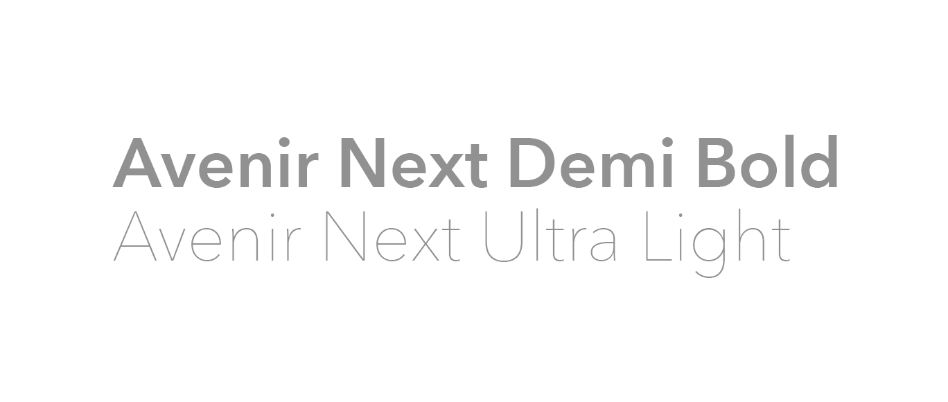
Typography
There is one main typeface that is used in the branding, but used in two different weights. One is bold, which would be used as the title font and the other is a thin stroke version of the typeface. The use of both variations in weight of the same sans-serif font creates a clean contrast that helps give hierarchy to the typography throughout the brand.